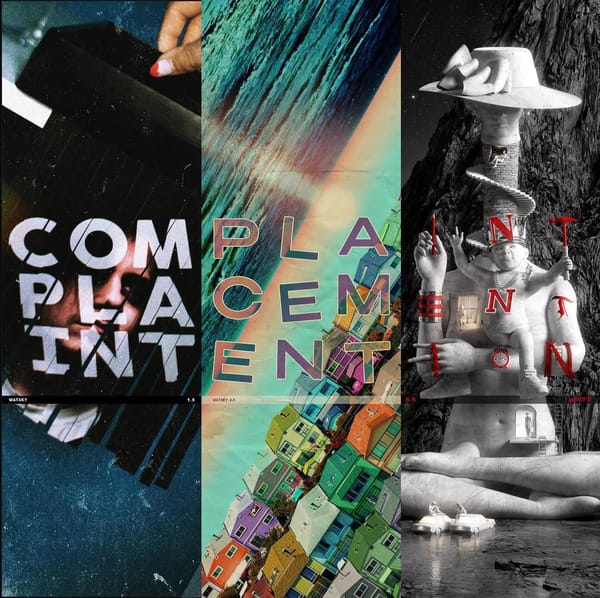
Mandy, Indiana 'URGH'
Experimental rock band Mandy, Indiana's eye catching album cover for URGH
February 6th was the release of Manchester experimental rock band Mandy, Indiana's sophomore album, URGH. It's 34 minutes over 10 tracks, and explores various sounds—it's harsh, raw, distorted, abrasive, noisy—vocals are in French and English, with a feature from rapper billy woods of the Armand Hammer duo.
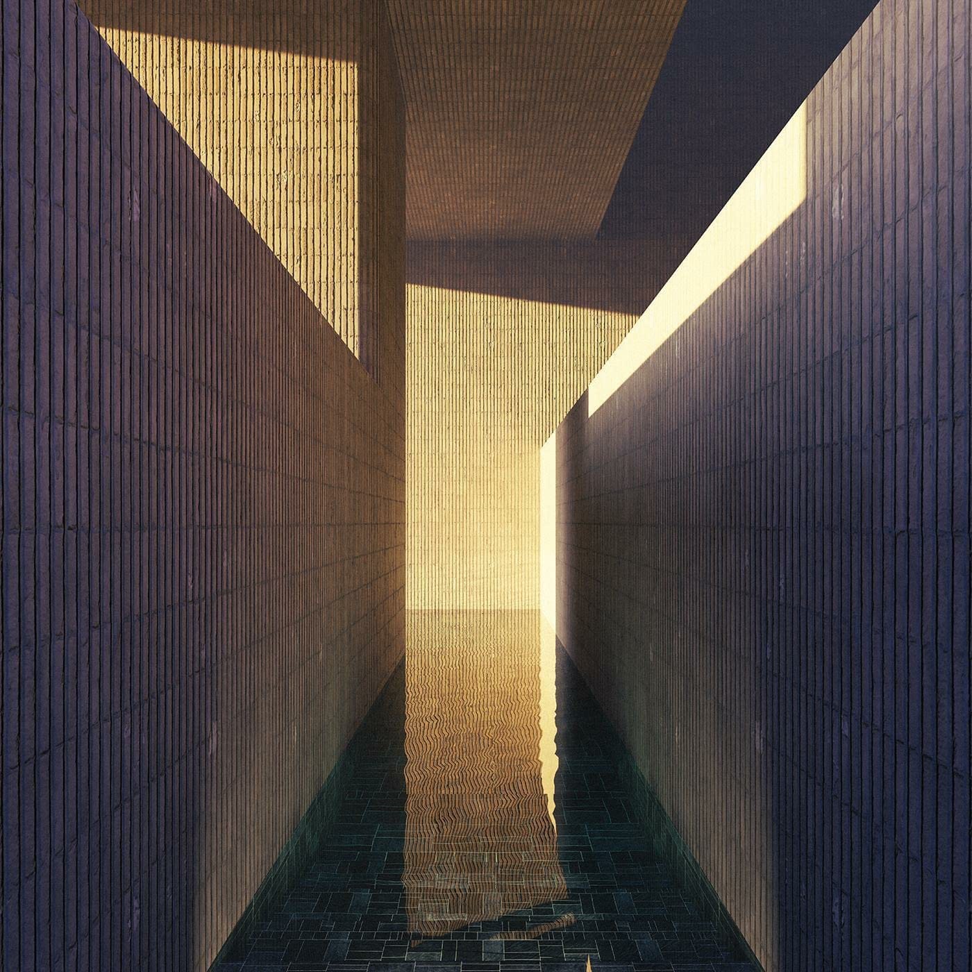
Their 2023 debut album, i've seen a way, is slightly more subdued, ambient, and ominous. The cover, designed by Jared Pike, features a golden-hour-lit liminal pool scene—possibly referencing or adapting the Sublimity/Poolrooms Backrooms level—somewhat misleading in its serenity. Frankly, it could be an article of its own. What first appears a calm, relaxing, golden scene, creates more questions as to the actual layout of this space, the unknowns around the corner and above. Listeners may enter this album expecting something relaxing and jazzy but become startled towards the end of the first track, realizing this is not what they expected.
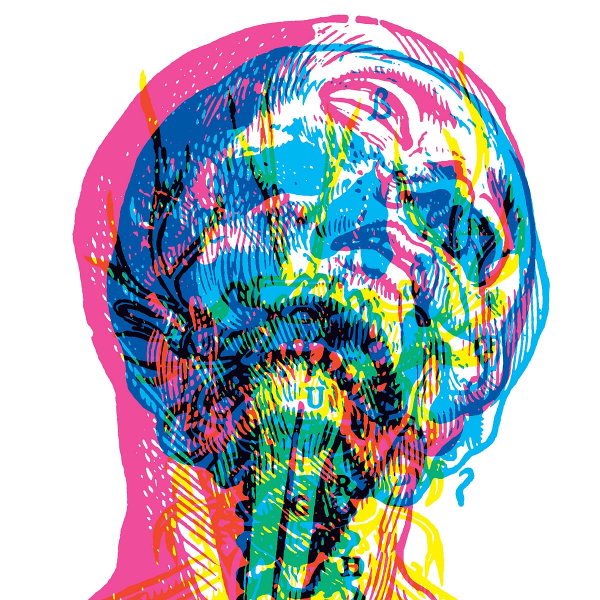
The artwork for URGH was designed by Carnovsky, an artist duo best-known for its project RGB, where layers of red, green and blue light are overlapped to form one image. From my understanding, URGH's cover is an adaptation of Vesalio n. 2, with uppercase serif letters spelling out the title of the album placed in the lower half.
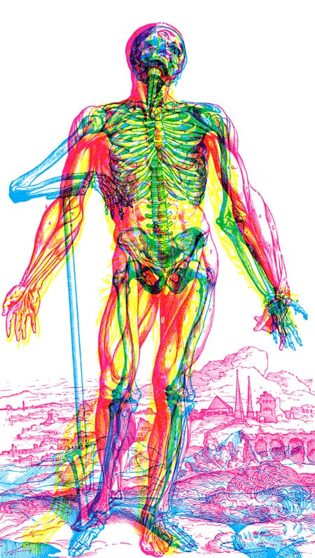
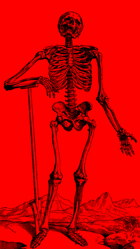
The original artwork is made up of three layers, each its own color, slightly offset, forming a different layer/system of the human body, as well as parts of the background landscape. Despite the project title RGB, I don't believe the work is composed of red green and blue. Rather, partly transparent shades of red, yellow and blue make up the base layers that create new colors when overlapped. When all three overlap, black is created.
The cover itself is framed around the head, with bold serif type spelling out "URGH" vertically. While there are letters on the body in the original artwork, they are different than the album cover. The head is recoiling upwards and slightly to the side, as if reacting to something ridiculous or annoying. I think this ties in with the overall noisy and overwhelming sound of the album, as well as the generally negative outlook of the lyrics. The separated and offset color layers could also reference one "coming apart" as a result of trauma or stress.
I also find the way the album artwork frames around the head works well compositionally, and maybe points towards the head and brain as the central point of mental health struggles, once again relating to the trauma expressed in some of the lyrics. The album title is place in the artwork, rather than distractingly being tucked in an upper corner, which makes for a more cohesive artwork.
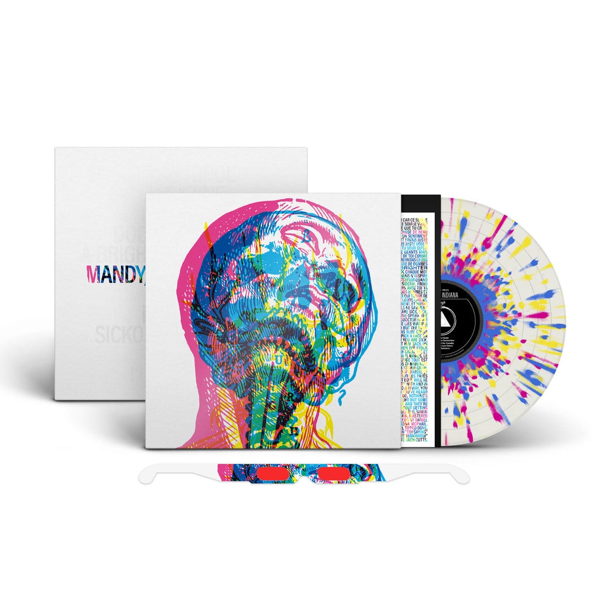
The "Sacred Bones" limited edition vinyl features magenta, yellow, and blue splatters on the white record in the preview images; the actual record appears with colored lines. There also seems to be editions with red, blue and yellow records, which would be randomly chosen per order. The reverse side feature the album name, band name, and track list in a light gray. The package also contains a lyric sheet, and the limited edition version includes RGB glasses which "reveal the artwork". The revealed version seems to show just one layer of the artwork, depending on the color of glasses randomly included.
Personally, I enjoy some of the experimental aspects of the album and appreciate artists seeking a rougher sound, though I don't see myself returning to listen to this album often. It's sometimes strange when musicians adapt an existing artwork into an album cover, but I think this works well in the context of the music, and it is an eye catching piece in both the original piece and as a cover. I also appreciate the experimental aspects of the limited edition record cover, even as a small gimmick, adding just one more dimension to the experience and presentation.