The Watsky Symmetry Trilogy
Rapper Watsky's unique album trilogy with connected album covers
George Watsky is a San Franscisco born poet & hip hop artist who I had become a fan of in middle school after discovering his fourth solo studio album, x Infinity (2016). I can't say that his music is my favorite anymore, but I still enjoy listening, and I was a first-day listener to his three most recent albums, Complaint (2019), Placement (2020), and Intention (2023). Watsky calls this "the Symmetry trilogy," and it's actually quite an interesting piece, the subject of today's post.
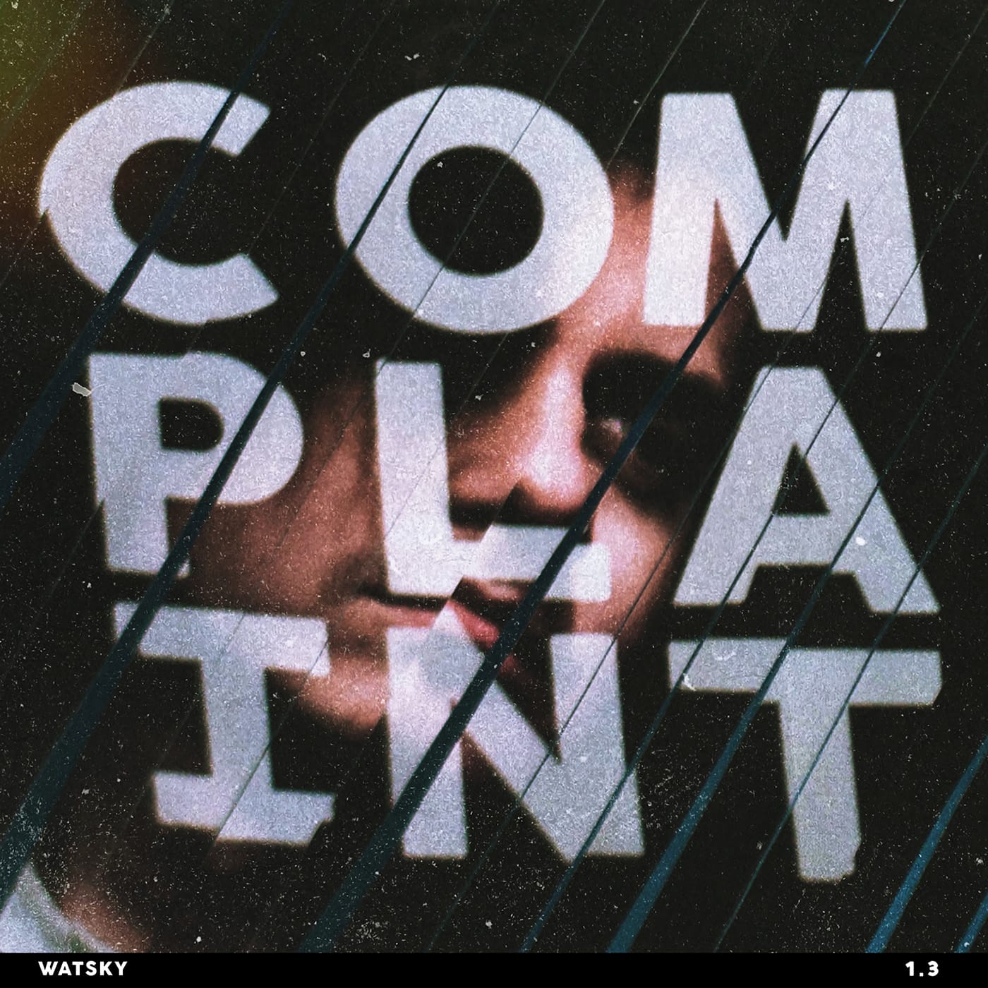
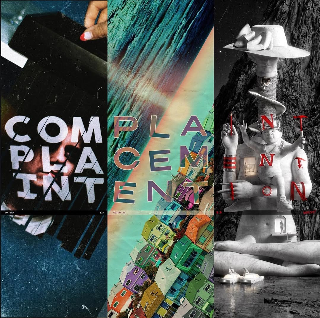
The first album of the trilogy is Complaint (2019), a 9 track LP that displayed a more pop and indie influence compared to Watsky's earlier work. The album is lyrically darker and slower too, discussing topics like love, insecurity and solidarity among the sad. Complaint's cover features a dark and blurry portrait of George on a diagonally cut surface with the 3x3 grid of letters to form the album's title. The cuts in the surface match the direction George is looking to have continuity, and the letters are also cut, indicating that they are actually on the surface of the photograph. Connor Moy and Mike Squires are credited for the artwork and cover photo, respectively.
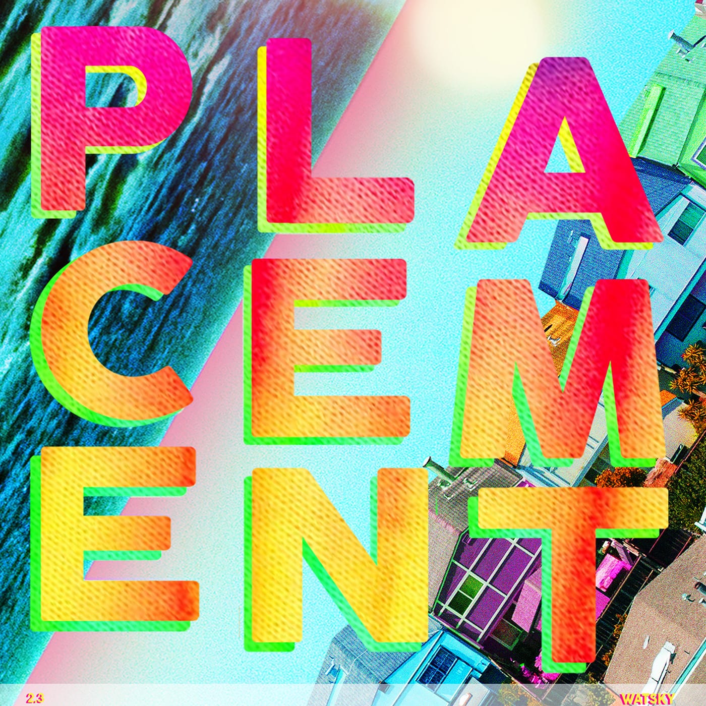
The second album is Placement (2020), another 9 track LP that's a bit more youthful and fun compared to Complaint. Topics for this album include youth, politics, and living despite facing hardships and suicidal thoughts. The cover features oversaturated and vividly colored houses in front of a beach, with the same grid for the album title. These are references to Watsky's growing up in the Bay Area, the "little boxes on the hillside" and uniformity of the suburbs. Overall, it's a big contrast from the darker elements on the previous album's cover, and instrumentals are similarly more upbeat and colorful. Mike Dempsey and Galen Frazer are credited for photography and cover design.
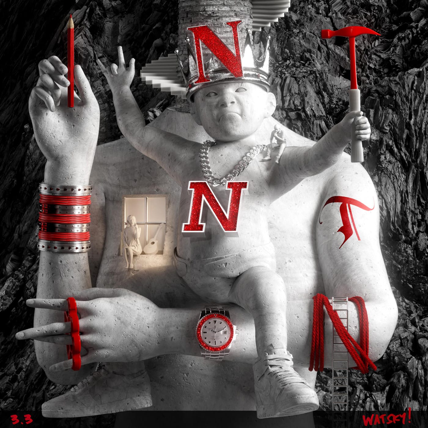
The final album is Intention (2023), which released slightly more than two years ago. When the album was initially released, it was a 9 track LP just like the other albums, but shortly after was revealed to have 9 more tracks that would unlock after completing an online puzzle that referenced lyrics from Watsky's music. The cover features a black-and-white statue of a human torso and toddler holding and wearing red objects, like an "N" necklace and watch. Some fans speculate that the red items are references to songs or lyrics, such as the "N" on the crown referencing Hardhead Ned, a character Watsky raps about in The Legend of Hardhead Ned from his 2013 album, Cardboard Castles. Kai Higham is credited for the cover art. The album overall is about finding what we want in life, rolling with the punches to achieve it, and wrapping up the trilogy and in some capacity, Watsky's discography.
I won't call INTENTION my last album... [but] I do know this is a major chapter break for me. It feels like the end of 'Watsky'
A whole other article could be written about the alternate reality game involved with Intention, a global treasure hunt where fans traveled around the world to find triangles. Watsky created a video explaining the whole thing, which when solved months later unlocked a bonus mixtape, Tommy Designer's Golden Fleece. I remember the excitement and curiosity when fans started visiting the website and realizing there was something bigger going on, and it ended up being really big, and pretty clever.
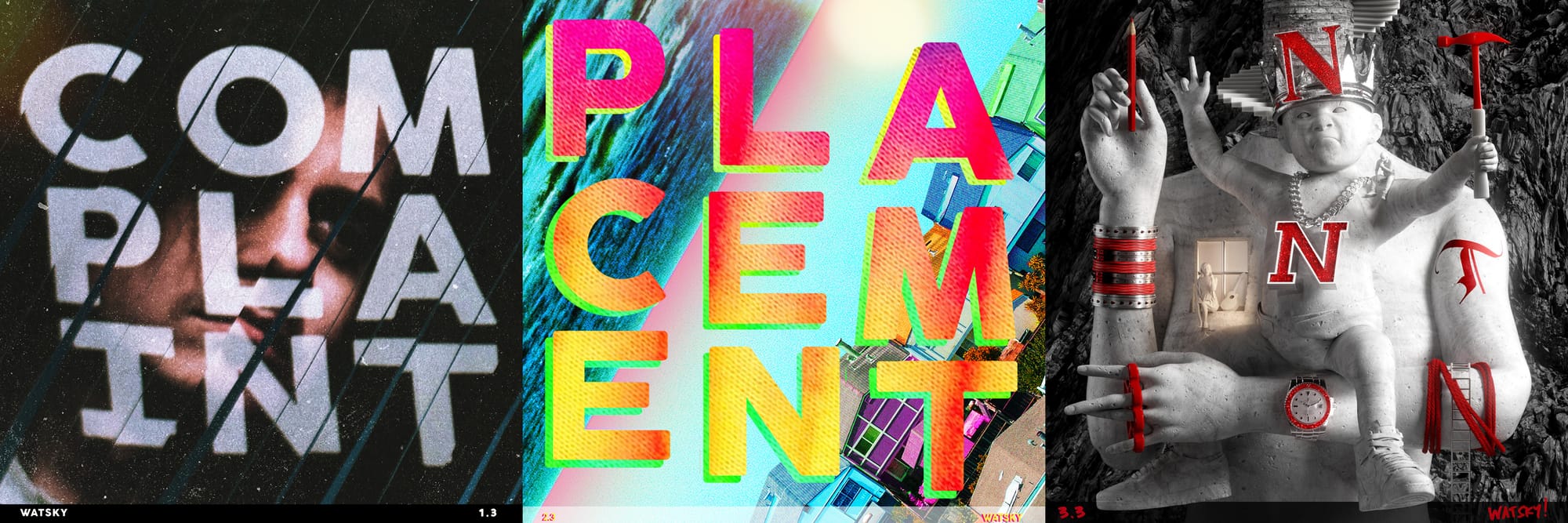
But returning to the album covers, as you'll notice, all 3 share similar layouts, featuring a 3x3 grid of their title and a rectangle on the buttom with Watsky's name and numbers, 1.3, 2.3, and 3.3. However, what you also may have noticed is that all 3 covers combine to spell out their names horizontally, in order. When Placement released and fans saw that the album covers line up, they started to speculate the final album name, which of course could only have been titled intention. Watsky shared that he and his friend built a script/algorithm to find 3 words that work this way, and built his next 3 albums around these words, and what they meant to him. This is a great concept that helps visually connect the album covers while still giving them their own themes and styles. And frankly, it's just cool that all 3 line up that way.

One additional thing is that while the Complaint and Placement covers share the same typeface, the Intention album doesn't, as it's made of physical items. This is a bit disappointing, it disrupts their congruency. This seems to have been considered after the release of Placement, as in the official poster published after Intention's release, it's been modified to be less saturated and have a different typeface with crooked letters. Unfortunately, it was too late, and vinyl owners may be a bit disappointed when placing all 3 together, despite that being the intent.
Overall, I found it a pretty cool concept from Watsky to help the trilogy be something more than just another set of albums, but it could have been improved with forethought regarding the Placement cover.


